Wanfa Forge Redesign of Cleaver - Taiwan community design
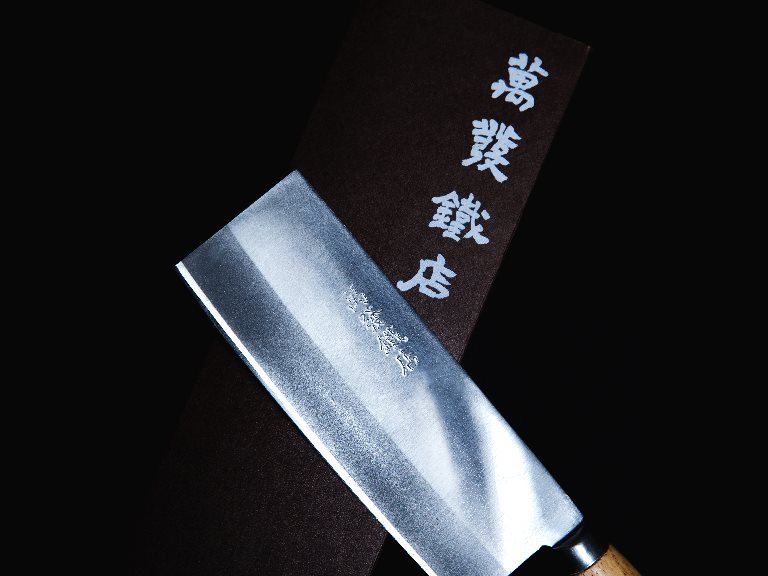
By upholding the persistence of a blacksmith, the traditional blacksmith has engaged in cross-field cooperation with modern craft design. Master Wanfa Su forges knives, while CAN Culture, Art & Nature redesigns the patterns and packaging of the knives. Every detail is insisted on in the hope that traditional ironwork craft can enter a new generation through the purest ironwork craft presented in the products.
Design of Materials for Shokunin School - Taiwan community design
Materials are designed for schoolchildren to feel the techniques of shokunins and experience the lifestyle of 100 master-craftsmen in an active and cute way so that the children can make interesting interactions with the instructor more effectively during the experience tours.
Fund Raising Project for Green Grass Occupational School - Taiwan community design
Green Grass Occupational School is the junior high department of Grass Book House. Its primary focus is the development of occupational skills. The concept of the main LOGO design is the image of the Grass children turning into flowers when they grow up and fly freely like butterflies.
Man-Fu Postpartum Care Center - Taiwan brand design
The starting point of the design is good fortune, which the gourd represents. The shape of a gourd is combined with the image of a mother holding a child to express the imagery of maternal love. The round outline gives the overall vision a sense of content and completeness.
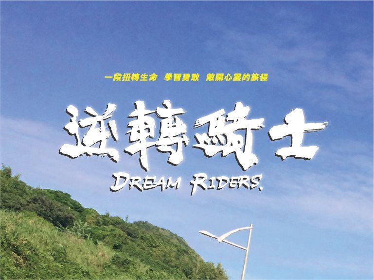
Dream Riders - Taiwan graphic design
Calligraphic fonts are used for the logotype design of Dream Riders to express the fiery spirit of riders. The word “victory” is printed in calligraphic fonts on the uniform, for which the color red is chosen to express vitality and passion.
Corporate Identity System of Leather-Playing Children Workshop - Taiwan brand design
The design of the brand logo is inspired by the faces of mischievous children; stitching elements are added and the color scheme uses the color of leather and the lively yellow to express the practice of Leather-Playing Children in the life ethos of “retired yet moving forward”.
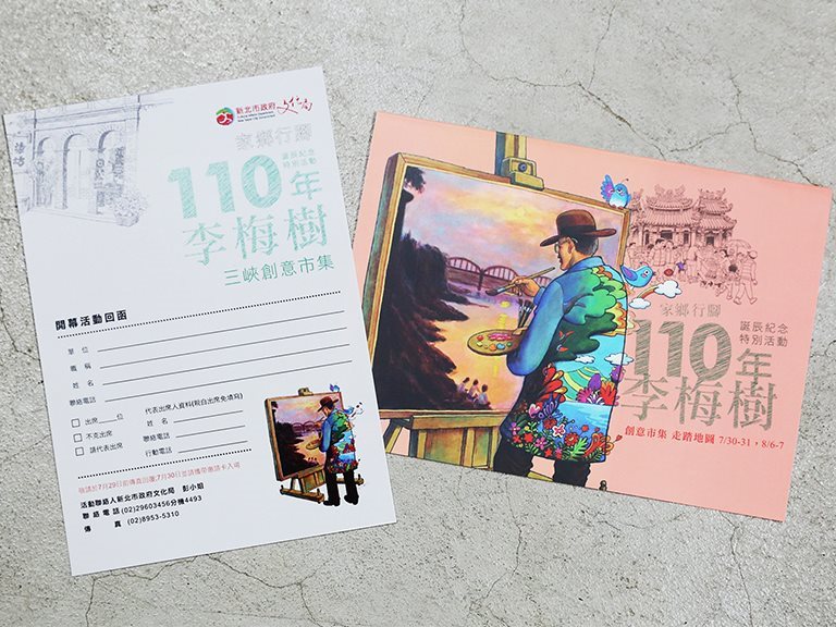
Commemoration of Mei-Shu Li’s 110th Birthday - Taiwan graphic design
We have also planned a tour for visiting the actual sites where Master Mei-Shu Li painted his works. You can appreciate the paintings while observing in detail the differences and similarities between the scenes that once existed, comparing them with their actual appearances now.
Harvest Coffee & Orchid Cafe - Taiwan brand design
Harvest Coffee & Orchid Cafe
Thank you for your subscription!
THANK YOU
Bring energy to Sanxia through culture and creativity,
changing the lives of the children in their hometown through action.
THANK YOU
Thanks for your information, we will get back to you as soon as possible.
