Contact Us Now!
E-MAIL/
thecan2010@gmail.com
PHONE/
+886 2 2671 7090
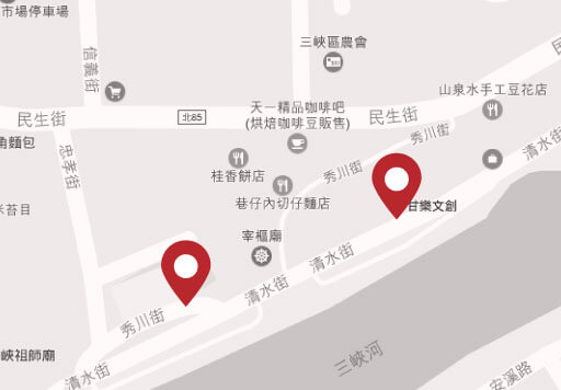
ADDRESS/
Ln. 13, Zhongshan Rd., Sanxia Dist., New Taipei City 23741, Taiwan (R.O.C.)
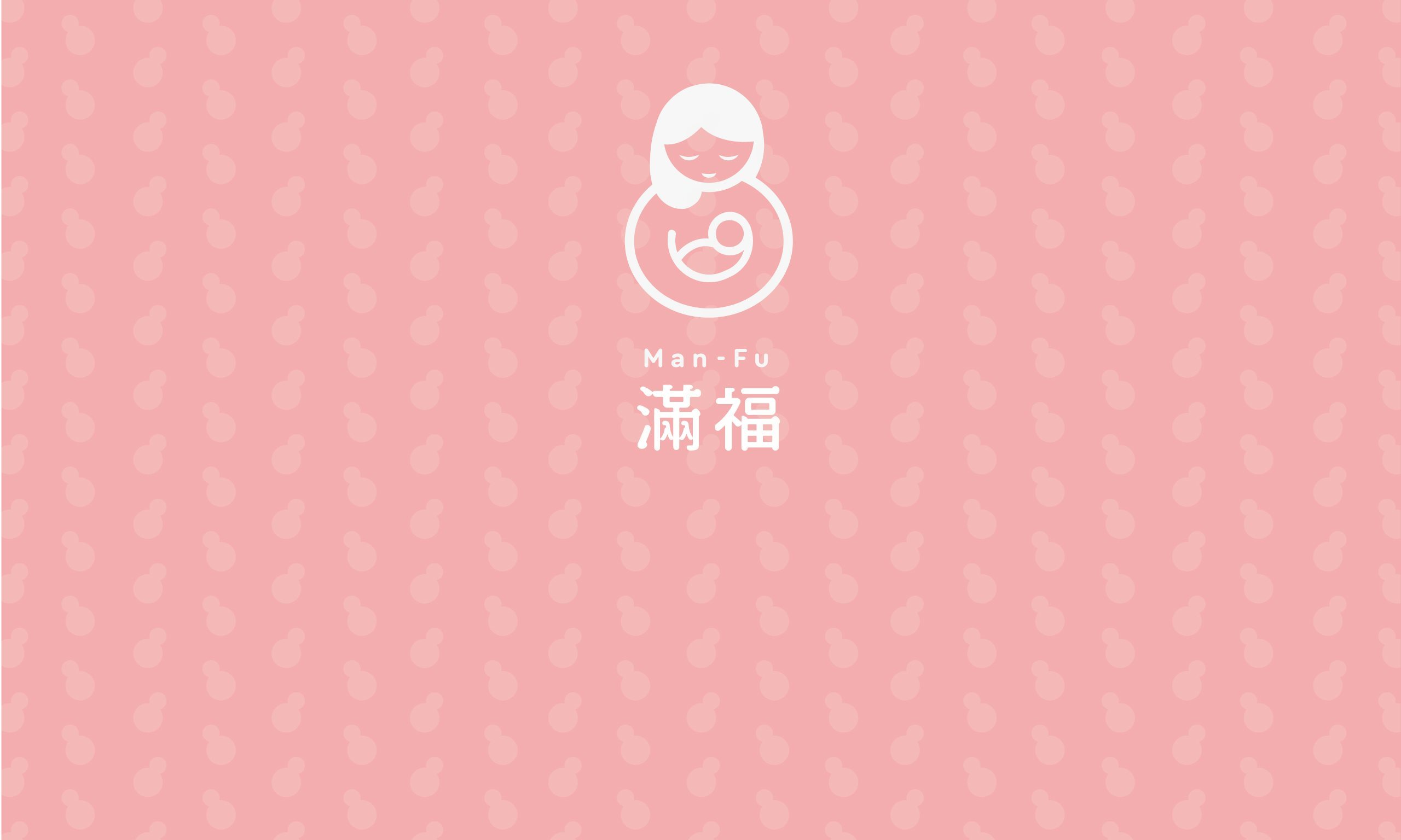
The starting point of the design is good fortune, which the gourd represents. The shape of a gourd is combined with the image of a mother holding a child to express the imagery of maternal love. The round outline gives the overall vision a sense of content and completeness.


The use of the logo enables clients to understand clearly the use and inviolable range of the logo when they read the promotional materials, thus maintaining the brand consistency of each promotional material.

Noto Sans(源柔ゴシック)is selected as the font to maintain the round appearance of the logo, as well as give a sense of warmth and consideration.