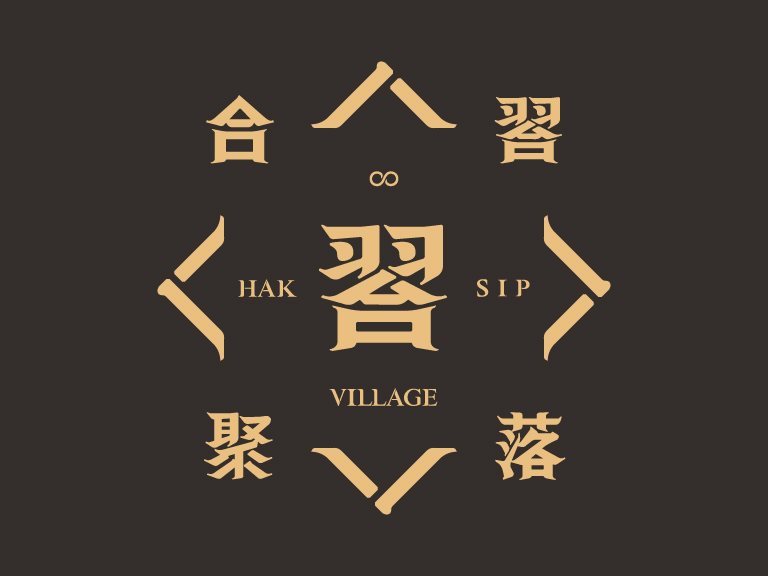
HAKSIP Village - Taiwan community design
The core spirit of HAKSIP Village is collective learning. The LOGO is based on man to create the significant value of HAKSIP Village; the characteristics of the LOGO are designed to match the colors and style of the space; the LOGO design is finally completed by using Chinese characters.
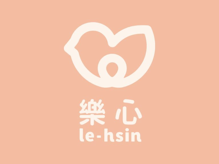
Le-Hsin Postpartum Care Center - Taiwan brand design
The shape of the bird represents comfort and ease. The round outline gives the overall vision a sense of content and completeness. When we were initially thinking about the design, five major conditions were used for the inspiration and extension of the general logo: ease, joy, content, comfort and protection.
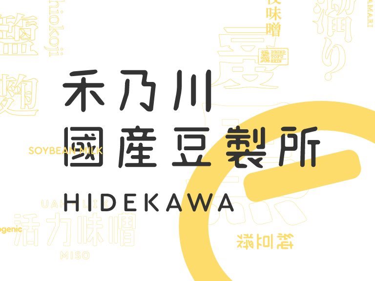
HIDEKAWA Domestic Soybean Products - Taiwan brand design
HIDEKAWA is a brand that represents Taiwan. A great deal of traditional Chinese characters is used on the product packages to convey the features of each product through the changes in the fonts. In addition to selling safe soybean products, HIDEKAWA has also inherited the mission of carrying forward the beauty of traditional Chinese characters.
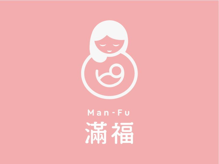
Man-Fu Postpartum Care Center - Taiwan brand design
The starting point of the design is good fortune, which the gourd represents. The shape of a gourd is combined with the image of a mother holding a child to express the imagery of maternal love. The round outline gives the overall vision a sense of content and completeness.
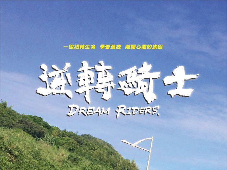
Dream Riders - Taiwan graphic design
Calligraphic fonts are used for the logotype design of Dream Riders to express the fiery spirit of riders. The word “victory” is printed in calligraphic fonts on the uniform, for which the color red is chosen to express vitality and passion.
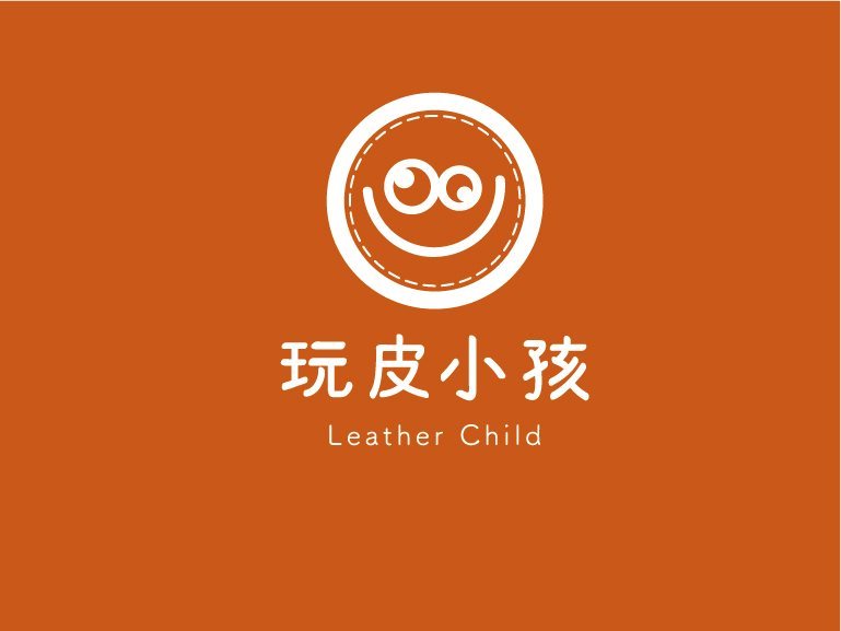
Corporate Identity System of Leather-Playing Children Workshop - Taiwan brand design
The design of the brand logo is inspired by the faces of mischievous children; stitching elements are added and the color scheme uses the color of leather and the lively yellow to express the practice of Leather-Playing Children in the life ethos of “retired yet moving forward”.
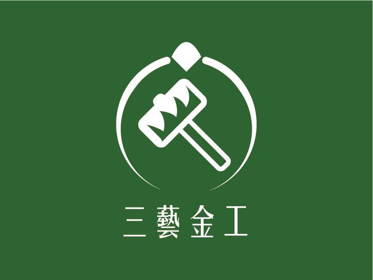
Corporate Identity System of Sanyi Metalworking - Taiwan brand design
Fate has brought CAN Culture, Art & Nature and Master Wen together. Through space, product and experience design, Sanyi Metalworking combines traditional solid techniques and designs. It combines craft, handicraft and creativity to make the shokunin brand of “Sanyi Metalworking”.
Harvest Coffee & Orchid Cafe - Taiwan brand design
Harvest Coffee & Orchid Cafe
Thank you for your subscription!
THANK YOU
Bring energy to Sanxia through culture and creativity,
changing the lives of the children in their hometown through action.
THANK YOU
Thanks for your information, we will get back to you as soon as possible.