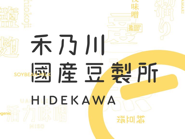
HIDEKAWA Domestic Soybean Products - Taiwan brand design
HIDEKAWA is a brand that represents Taiwan. A great deal of traditional Chinese characters is used on the product packages to convey the features of each product through the changes in the fonts. In addition to selling safe soybean products, HIDEKAWA has also inherited the mission of carrying forward the beauty of traditional Chinese characters.
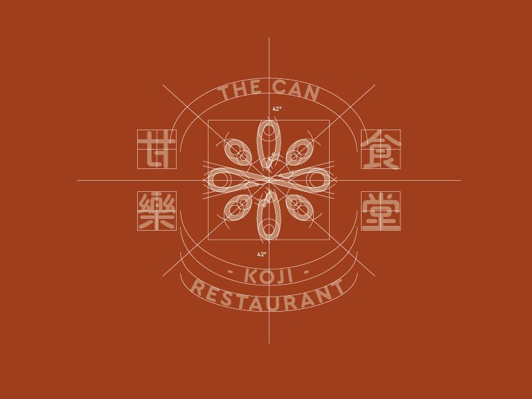
Corporate Identity System of KOUJI Restaurant - Taiwan brand design
The colors selected are extracted from all of the elements in KOUJI Restaurant. The primary color is brick red, which is the carrier of the entire architecture of KOUJI Restaurant.
Thank you for your subscription!
THANK YOU
Bring energy to Sanxia through culture and creativity,
changing the lives of the children in their hometown through action.
THANK YOU
Thanks for your information, we will get back to you as soon as possible.