Le-Hsin Postpartum Care Center - Taiwan brand design
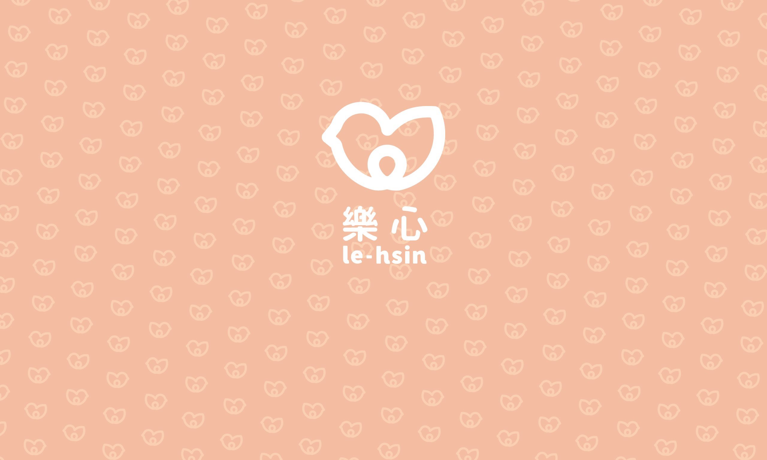
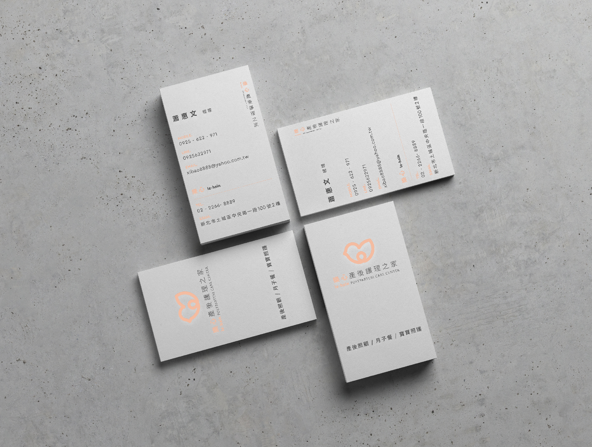
The shape of the bird represents comfort and ease. The round outline gives the overall vision a sense of content and completeness. Protecting the egg in the nest also conveys the message of safe guarding.
When we were initially thinking about the design, five major conditions were used for the inspiration and extension of the general logo: ease, joy, content, comfort and protection.
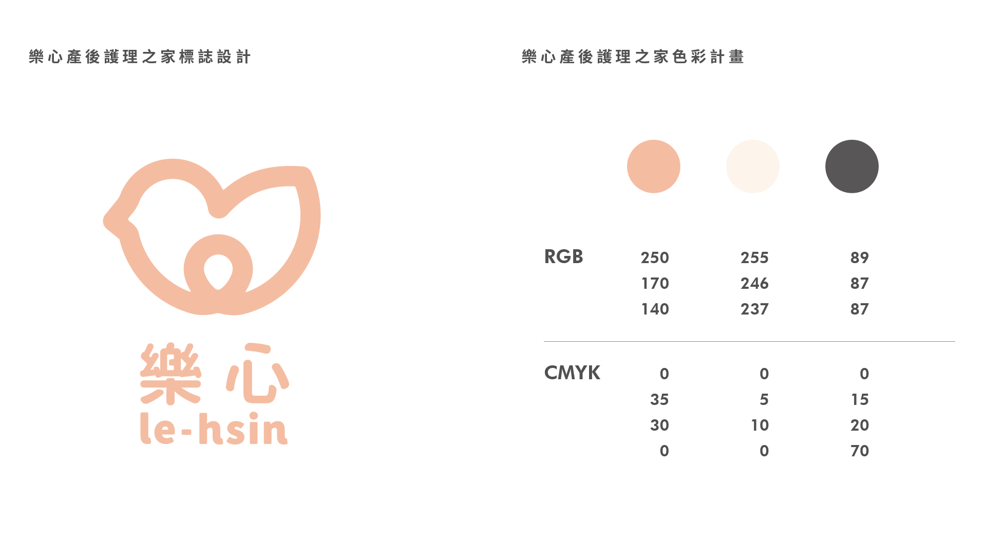
The primary colors include peach, ivory white and dark grey; the reasons are as follow:
Peach: a little pink is added to orange to enhance the feeling of softness and happiness, and it is not too bright.
Ivory white: a little yellow and red is added to white to form the high grade texture of ivory white.
Dark grey: the depth of black is decreased by adding a little red to enhance the feeling of warmth.
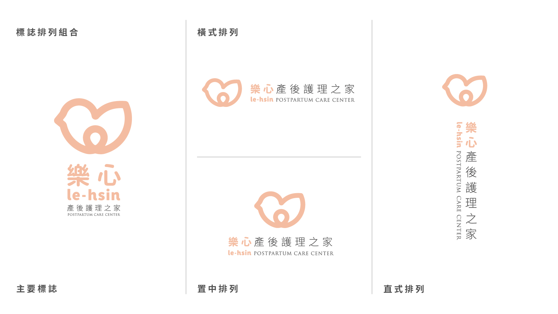
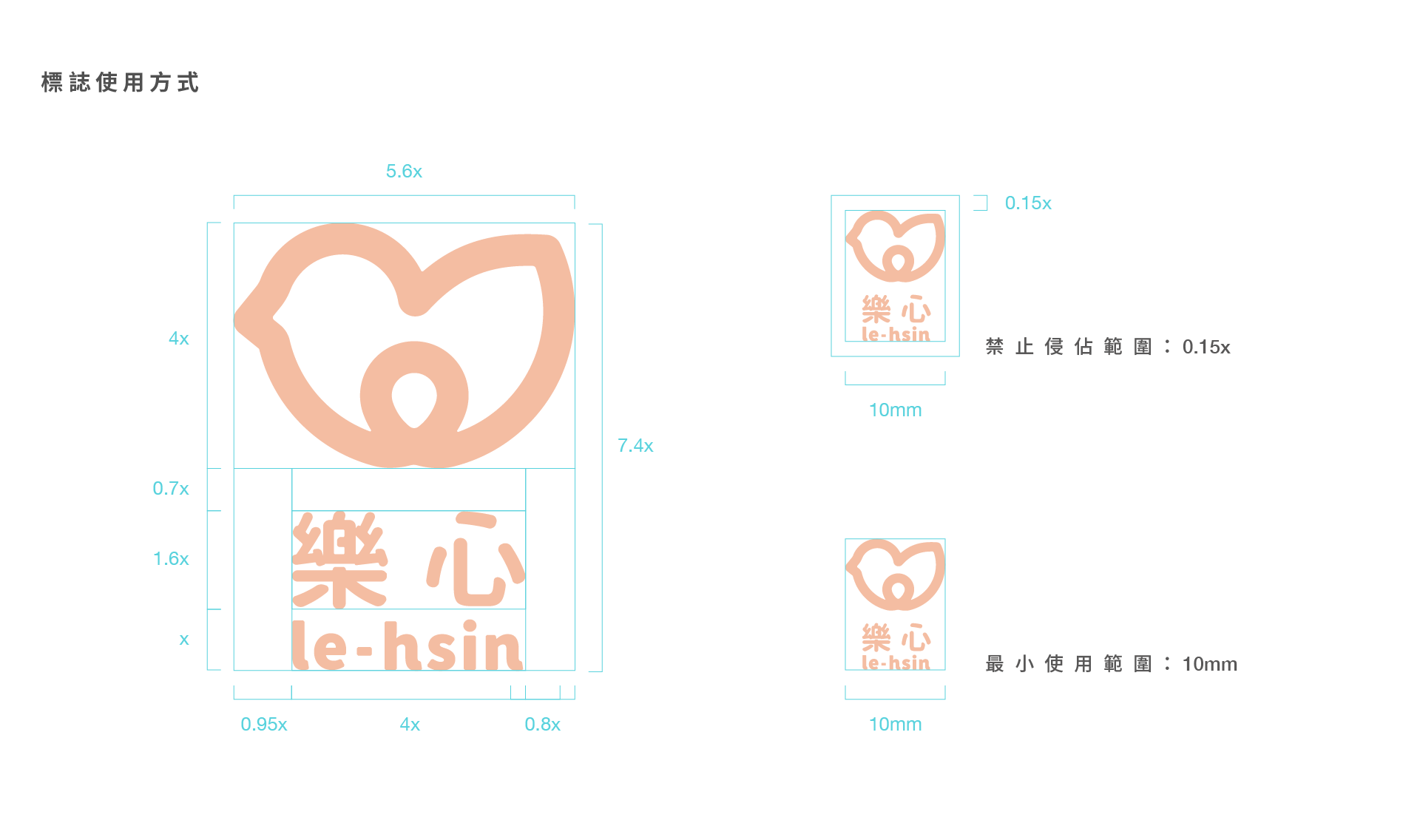
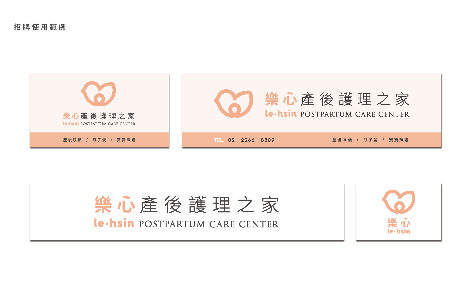
The use of the logo enables clients to understand clearly the use and inviolable range of the logo when they read the promotional materials, thus maintaining the brand consistency of each promotional material.
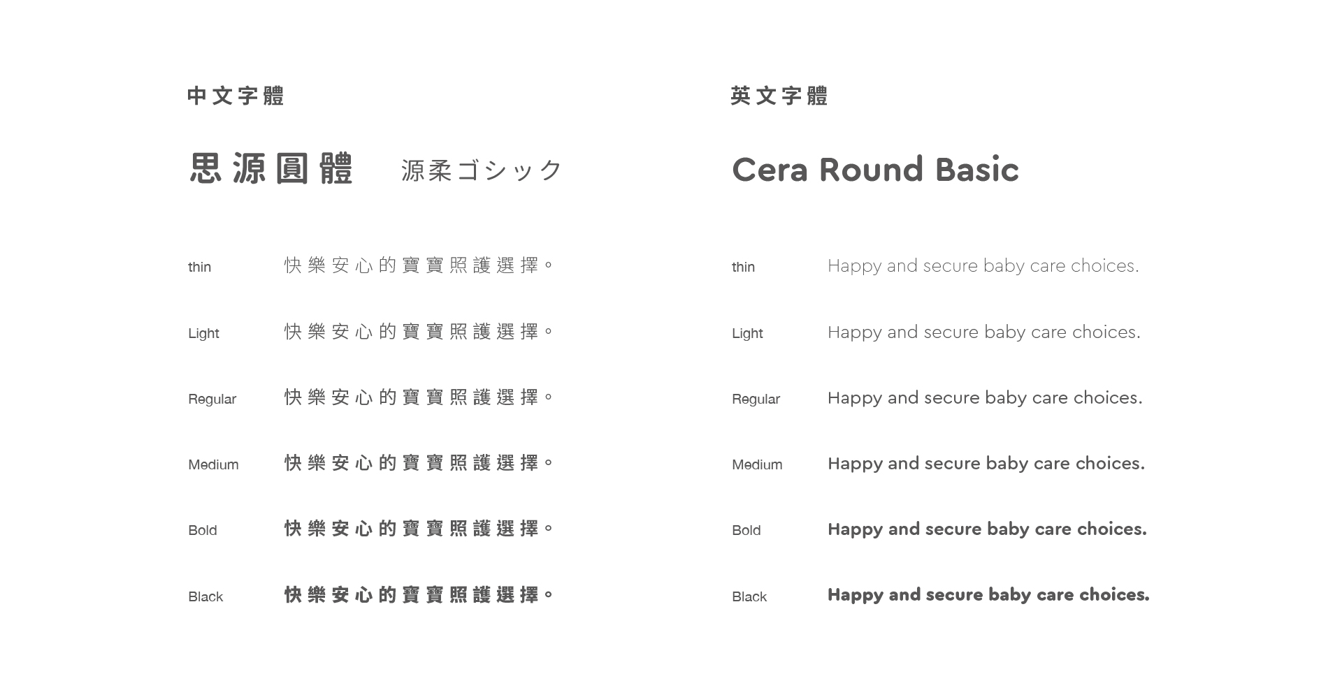
Noto Sans(源柔ゴシック)is selected as the font to maintain the round appearance of the logo, as well as give a sense of warmth and consideration.
You may also like
The most popular products
Fund Raising Project for Green Grass Occupational School - Taiwan community design
A group comprised of youn...
Placemaking – The Sanxia & Yingge Project - Taiwan community design
The Sanxia and Yingge col...
