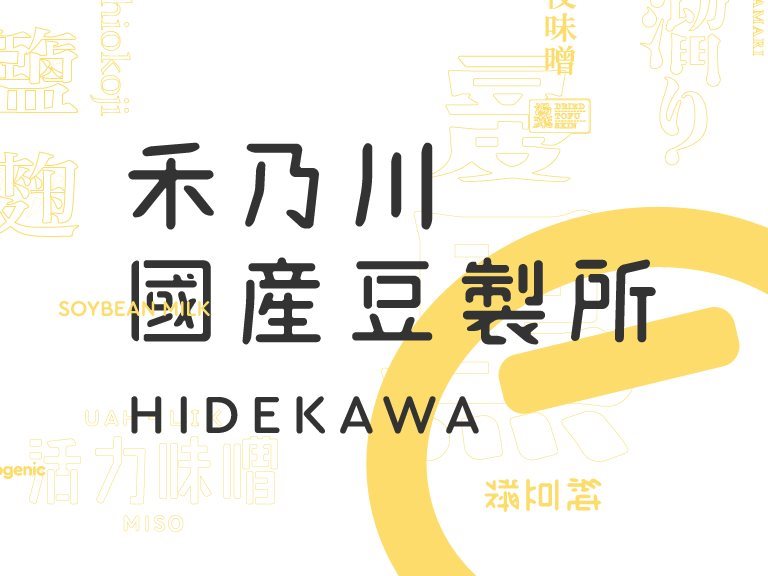
HIDEKAWA is a brand that represents Taiwan. A great deal of traditional Chinese characters is used on the product packages to convey the features of each product through the changes in the fonts. In addition to selling safe soybean products, HIDEKAWA has also inherited the mission of carrying forward the beauty of traditional Chinese characters.
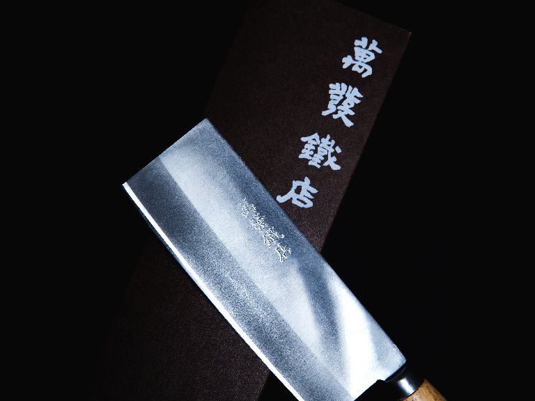
Wanfa Forge Redesign of Cleaver - Taiwan community design
By upholding the persistence of a blacksmith, the traditional blacksmith has engaged in cross-field cooperation with modern craft design. Master Wanfa Su forges knives, while CAN Culture, Art & Nature redesigns the patterns and packaging of the knives. Every detail is insisted on in the hope that traditional ironwork craft can enter a new generation through the purest ironwork craft presented in the products.
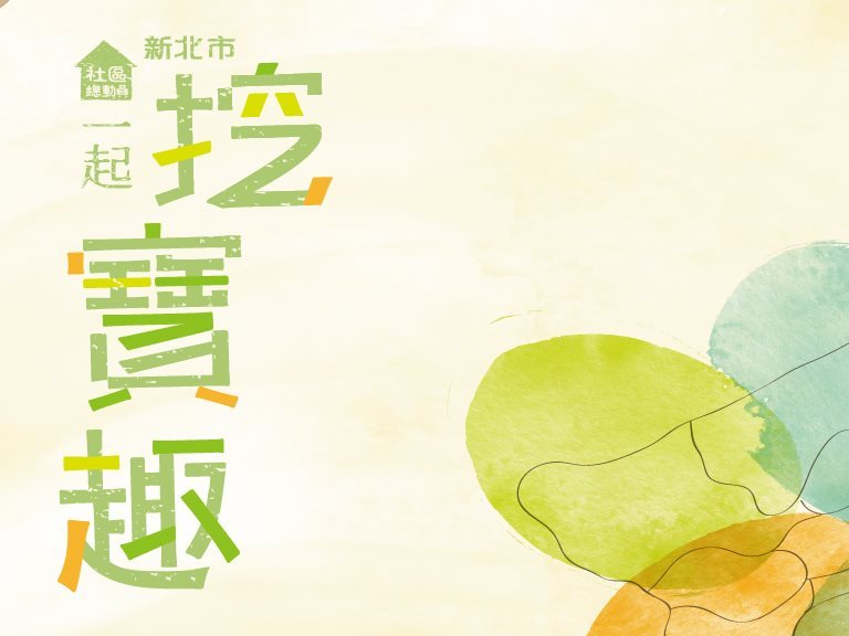
Travel Brochure of the Department of Cultural Affairs - Taiwan graphic design
With small stories as the core axis, the travel brochure of the Department of Cultural Affairs, New Taipei City uses illustrations to draw a map of New Taipei City. Each area on the map has hand-drawn illustrations of local features to create connections between the people rapidly.
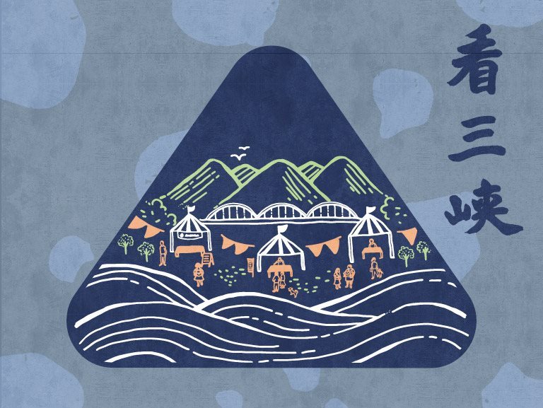
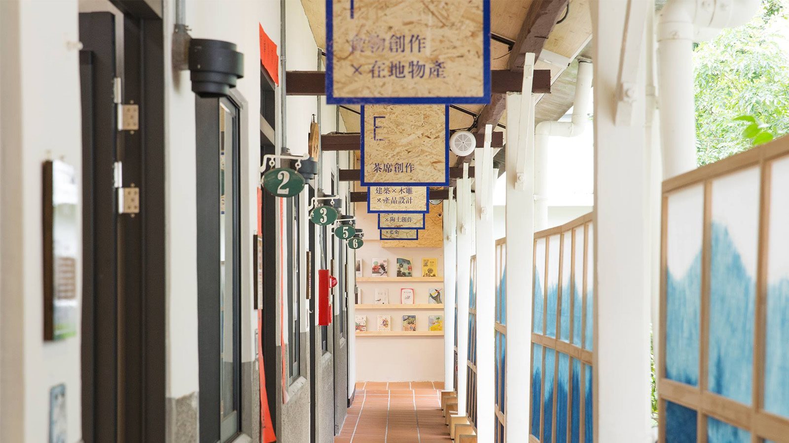
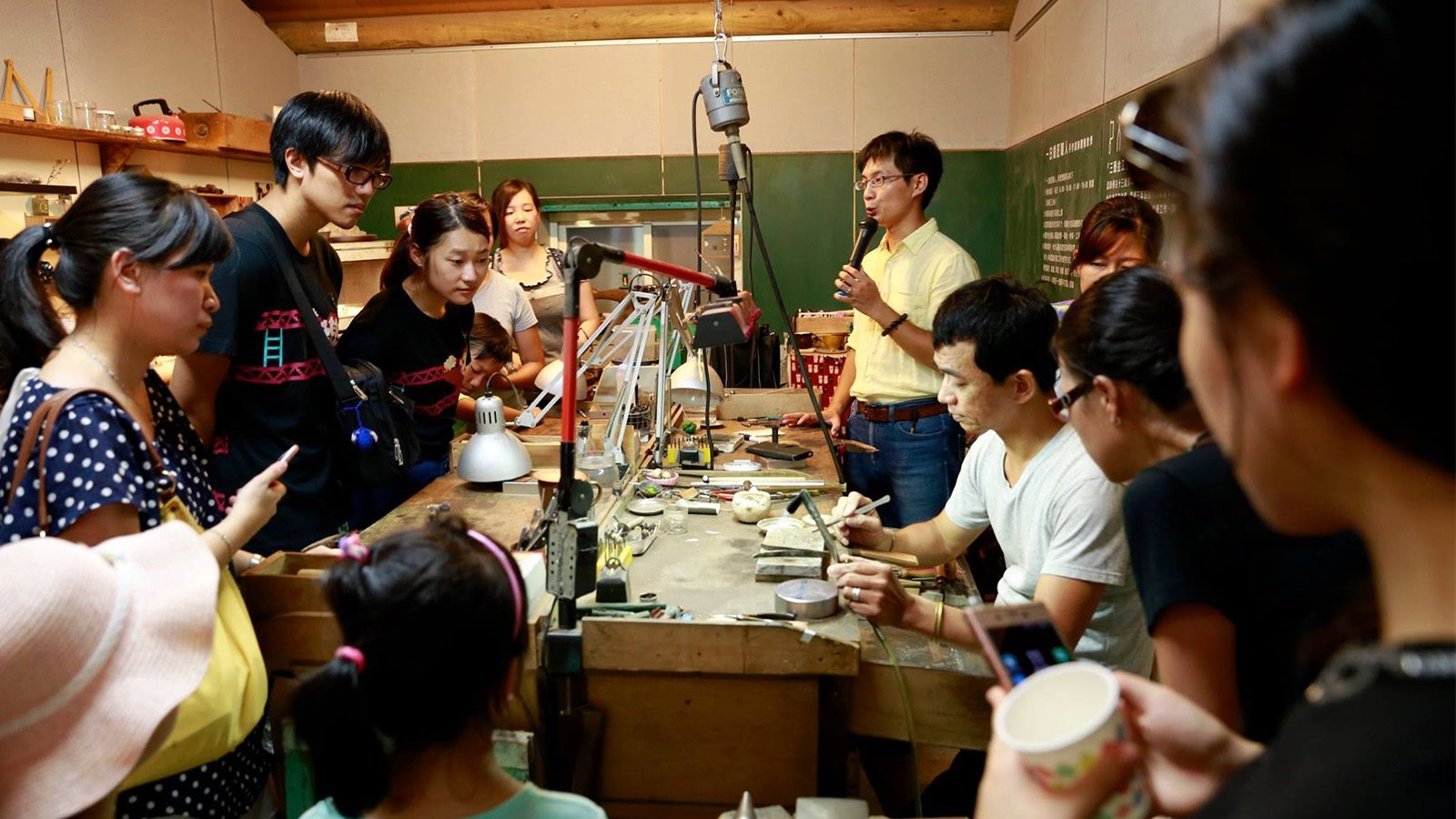
“CAN Sanxia” – Vision of Huashan Market - Taiwan community design
The objectives of this market planning is to consolidate craft shokunins of feature industries in Sanxia, think about how to integrate existing cultural and creative resources, and introduce innovative designs, image videos and regional cultural tours for traditional crafts to come back with a brand new appearance.
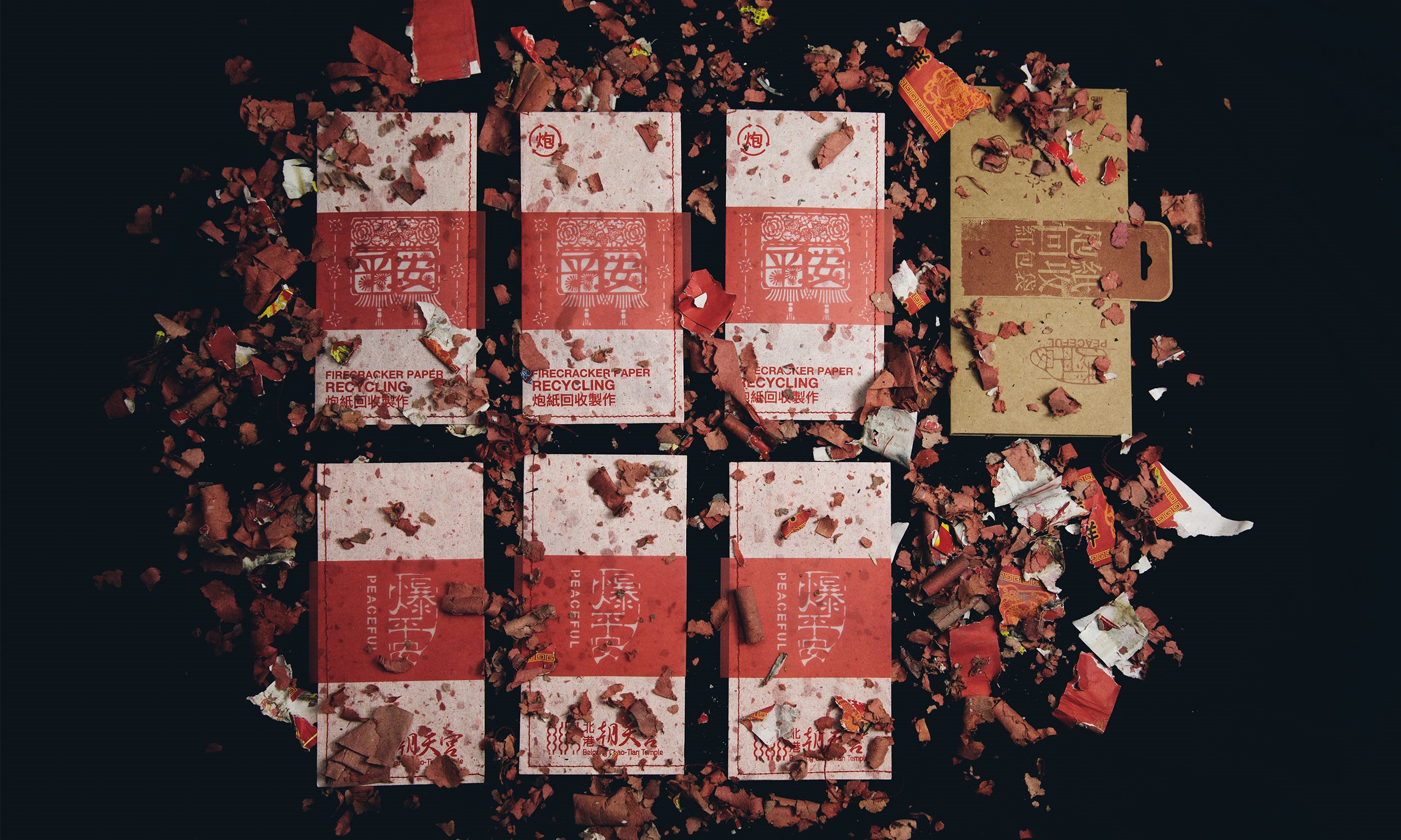
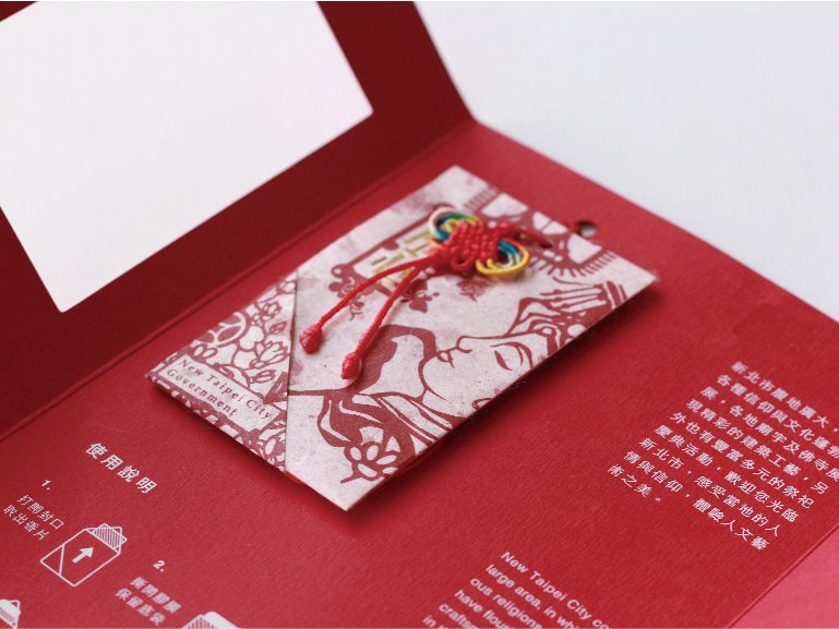
In order to allow more people to understand Taiwanese customs, as well as integrate the trend of environmental protection, young artists in New Taipei City applied their creativity and recycled disposed firecracker scraps to make them into blessing sachets.
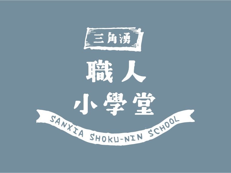
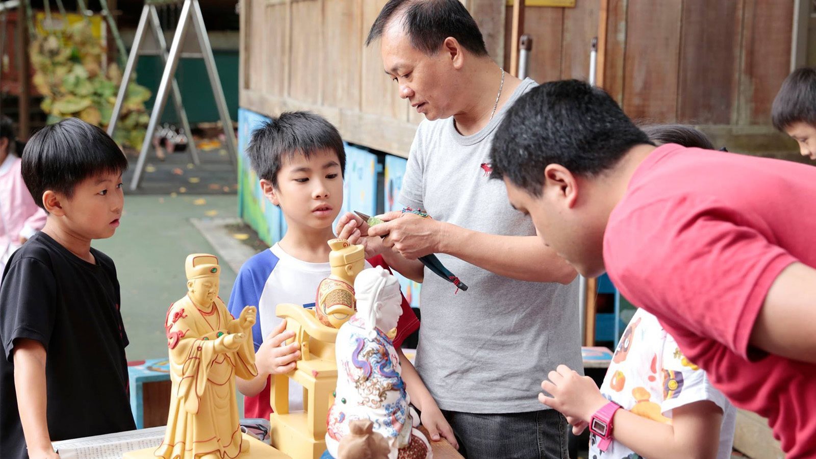
Design of Materials for Shokunin School - Taiwan community design
Materials are designed for schoolchildren to feel the techniques of shokunins and experience the lifestyle of 100 master-craftsmen in an active and cute way so that the children can make interesting interactions with the instructor more effectively during the experience tours.
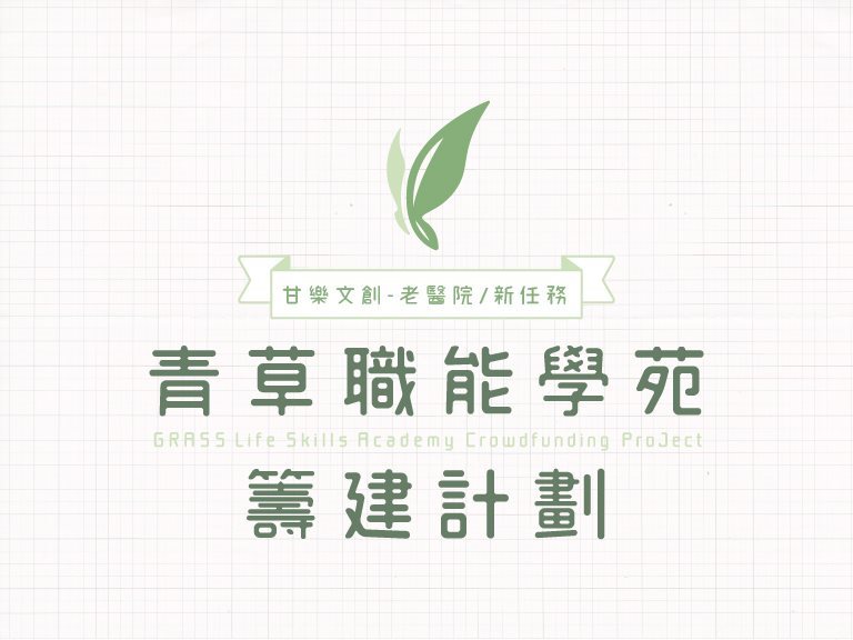
Fund Raising Project for Green Grass Occupational School - Taiwan community design
Green Grass Occupational School is the junior high department of Grass Book House. Its primary focus is the development of occupational skills. The concept of the main LOGO design is the image of the Grass children turning into flowers when they grow up and fly freely like butterflies.
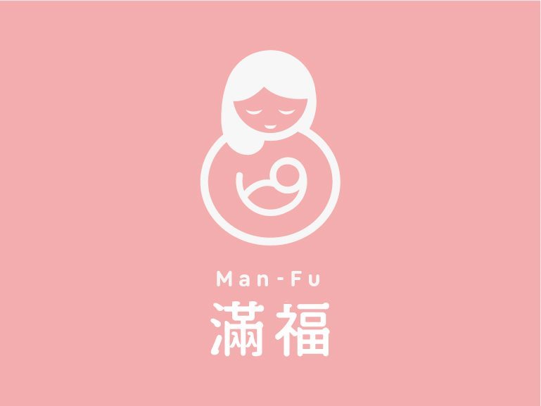
Man-Fu Postpartum Care Center - Taiwan brand design
The starting point of the design is good fortune, which the gourd represents. The shape of a gourd is combined with the image of a mother holding a child to express the imagery of maternal love. The round outline gives the overall vision a sense of content and completeness.
We share life stories, community activities, and information on special offers with every friend
Please enter your email address below to receive our newsletter
Thank you for your subscription!
THANK YOU
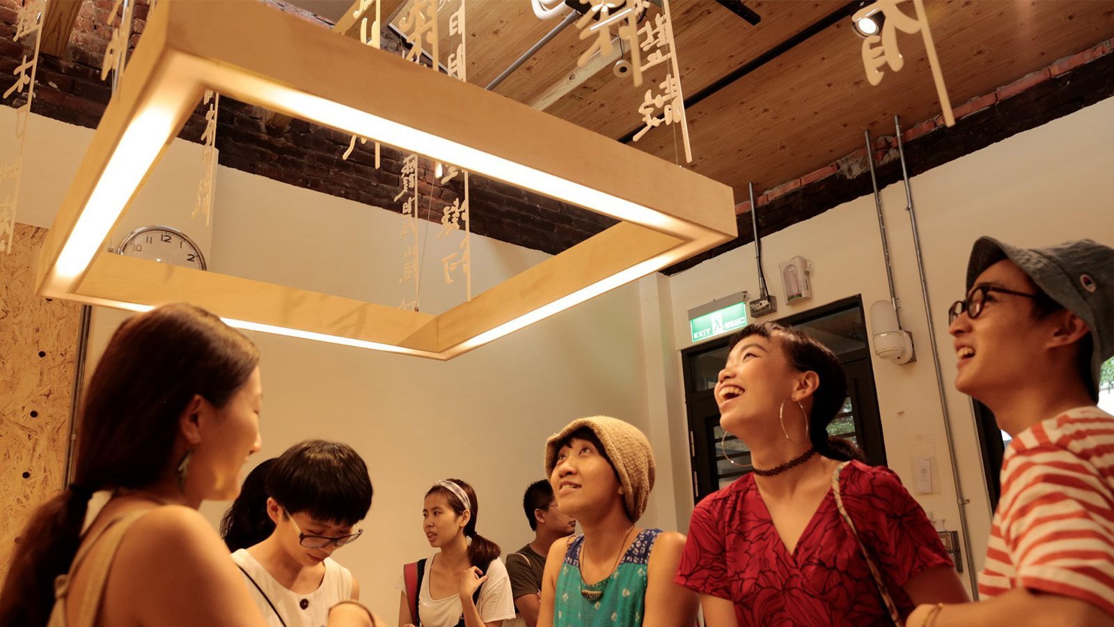
Bring energy to Sanxia through culture and creativity,
changing the lives of the children in their hometown through action.